Who are the Pantone organization.
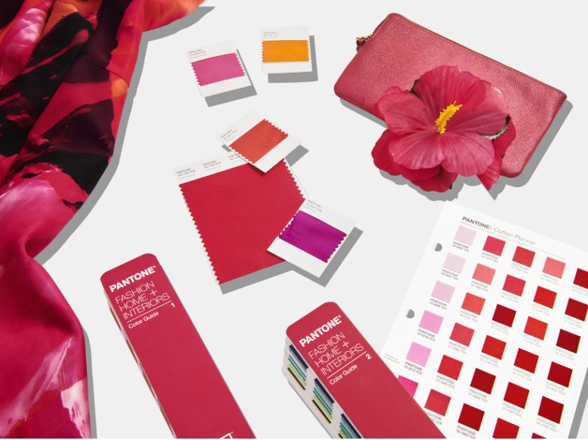
The Pantone organization is a globally recognized authority on color. It is best known for its Pantone Matching System (PMS), a standardized color matching system used in various industries, including graphic design, fashion, and printing.
The company was founded in 1962 by Lawrence Herbert and was initially focused on producing color cards for the cosmetic industry. However, it expanded its scope and developed the Pantone Matching System in the late 1960s. This system consists of a vast collection of standardized colors, each identified by a unique number and name. It provides a consistent and reliable way for designers, manufacturers, and others to communicate and reproduce specific colors accurately.
Pantone’s color standards are widely used in a variety of industries. Designers and creatives rely on Pantone colors to ensure consistency and accuracy in their work. For example, in the fashion industry, Pantone’s color trends influence designers’ color choices for clothing and accessories each season. Similarly, Pantone’s Color of the Year, an annual selection of a trending color, has a significant impact on design and marketing across various industries.
Pantone has become a prominent and influential organization, providing color expertise and consultation services to professionals. Its color systems and trends have become industry standards, facilitating color communication and fostering creativity in design and visual expression.
How does the pantone organization decide the colour of the year.
- Trend Analysis: Pantone’s color experts closely monitor and analyze trends in various industries such as fashion, design, art, entertainment, and travel. They observe emerging color palettes, popular hues in collections, and influential cultural shifts.
- Color Psychology: Pantone considers the psychological impact of colors and their potential to evoke emotions and convey messages. They evaluate how a particular color resonates with the current social and cultural climate and how it can inspire and influence people.
- Market Research: Pantone conducts extensive market research, gathering insights from professionals in design, fashion, and related industries. They collaborate with experts, designers, and influencers to understand their color preferences and their vision for the future.
- Global Events and Influences: Pantone takes into account major events, both global and local, that have an impact on color trends. This includes art exhibitions, film releases, international sporting events, social movements, and more.
- Color Evaluation: Pantone’s color experts review and deliberate on a range of potential colors, considering their relevance, versatility, and potential impact. They assess each color’s ability to capture the spirit of the time and resonate with a wide audience.
- Final Selection: After careful consideration, Pantone’s team collectively decides on the Color of the Year. The chosen color is seen as a representation of the current zeitgeist, reflecting the cultural, social, and emotional aspects of the year ahead.
The Color of the Year selection is intended to inspire and guide industries in their creative processes, from fashion and interior design to graphic design and marketing. It serves as a touchstone for professionals seeking color direction and enables them to align their work with the current trends and consumer preferences.
It’s important to note that Pantone’s Color of the Year is not meant to dictate or limit color choices, but rather to provide a point of reference and inspiration for creative endeavors across various industries.
How can you use Pantone colours for wedding trends.
- Color Palette Selection: Pantone releases a Color of the Year and seasonal color palettes, which can serve as inspiration for your wedding color scheme. Explore their color guides or consult their website to find trending and complementary colors that resonate with your vision.
- Decor and Floral Arrangements: Incorporate Pantone colors into your wedding decor, including table settings, linens, drapery, and floral arrangements. Use the selected colors for your centerpieces, bouquets, boutonnieres, and other floral elements to create a cohesive look.
- Stationery and Invitations: Infuse Pantone colors into your wedding invitations, save-the-dates, programs, and other stationery. Work with a graphic designer or stationery vendor to incorporate the chosen colors into the design, typography, and overall aesthetic of your wedding stationery.
- Fashion and Attire: Consider using Pantone colors for your bridal party’s attire, including bridesmaid dresses, groomsmen’s accessories, and even your own wedding gown or suit. This can create a unified and harmonious look among your wedding party.
- Cake and Desserts: Collaborate with your baker to incorporate Pantone colors into your wedding cake design or dessert table. They can use colored frosting, edible decorations, or even fondant to match your chosen colors.
- Lighting and Ambiance: Utilize lighting to enhance the chosen Pantone colors. Colored uplighting or accent lighting can transform your venue and create a specific atmosphere that aligns with your color scheme.
Remember, Pantone colors are a reference point, and it’s important to work with vendors, designers, and planners who can accurately match the colors and bring your vision to life. They can use Pantone color guides or digital references to ensure consistency.
Using Pantone colors for wedding trends can help you create a cohesive and stylish look throughout your wedding, tying together various elements and enhancing the overall aesthetic.
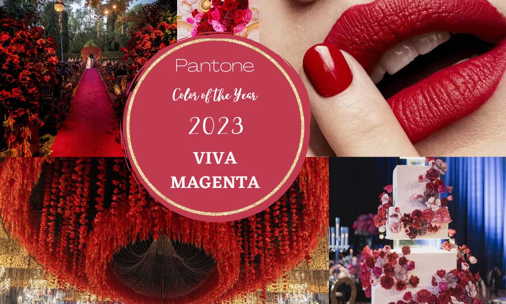
Pantone’s Color of the Year 2023.
Viva Magenta (18-750), pulsates with energy and vitality, defying convention. Rooted in nature and descending from the red family, Viva Magenta represents a new signal of strength. It embodies bravery and fearlessness, radiating a joyous and optimistic spirit that ushers in a new narrative.
This year’s Color of the Year is powerful and empowering. It is an animated red that revels in pure joy, encouraging experimentation and self-expression without limits. Viva Magenta is an electrifying and boundless shade that stands out as a statement. It welcomes everyone with the same zest for life and rebellious spirit. Audacious, witty, and inclusive, PANTONE 18-1750 Viva Magenta is a transformative color that drives design towards a more positive future.
The Meaning Behind Viva Magenta.
As we strive to balance our digital and physical lives, our appreciation for the natural world continues to grow. The Color of the Year 2023 acknowledges our deep connection to nature, a connection that intensifies with the rise of climate change awareness, sustainability efforts, and land preservation movements.
During the selection process for this year’s Color of the Year, Pantone observed a heightened appreciation and awareness of nature reflected in numerous lifestyle trends. We are bringing more living elements into our homes, such as plants, florals, living walls, and rejuvenating outdoor spaces. After pausing activities due to the pandemic, we now find renewed enjoyment in travel, sports, and outdoor recreation. Our focus on public health has made us more conscious of protecting our bodies, seeking trusted, life-giving ingredients. All these trends signify our recognition of the resilience and vitality found in the natural world.
Viva Magenta’s organic origins can be traced back to the cochineal beetle. This remarkable insect produces carmine dye, one of nature’s most precious, potent, and vibrant dyes. The red hue of Viva Magenta connects us to the essence of the natural world, instilling us with a primal sense of strength.
The Color of the Year 2023 harmonizes the richness, warmth, and fortitude of natural elements with the expansive horizons of the digital world. The result is a red shade that expands our authenticity and opens new possibilities for self-expression in the metaverse. Viva Magenta’s raw power inspires us to embrace confidence and bravery in our digital interactions.
Viva Magenta Color Psychology.
Reds are power colors that celebrate life, and Viva Magenta, as a bright crimson red, strikes a balance between boldness and fun. It exudes rebellion without sacrificing softness, embodying a fierce grace that encourages us to approach life with confidence and humanity. In an increasingly interconnected world, thanks to the digital space, we are more deeply connected to one another than ever before. While we may not fully comprehend the depths of others’ experiences, we can strive to deepen our empathy. The Color of the Year 2023 speaks to our desire to embrace new challenges, unconventional paths, and approach others with compassion.
What sets this year’s Color of the Year apart from last year’s choice, PANTONE 17-3938 Very Peri, which also blended technology and nature, is Viva Magenta’s response to our collective need for strength.
In the face of prolonged disruptions caused by the pandemic, wars, an unstable economy, social unrest, supply chain challenges, and mounting climate change concerns, we yearn for healing. Yet, we also need the motivation to persevere. Viva Magenta envelops us in both power and grace, igniting our spirits with the vigor we crave as we venture forth into the world.
Here are the Pantone Colors of the Year for the last five years:
- 2022: Very Peri (Pantone 17-3938) A vibrant and soothing shade of purplish-blue, representing calmness, spirituality, and optimism.
- 2021: Ultimate Gray (Pantone 17-5104) and Illuminating (Pantone 13-0647) Ultimate Gray is a solid and dependable gray color symbolizing resilience and strength. Illuminating is a bright and cheerful yellow color representing energy, positivity, and hope.
- 2020: Classic Blue (Pantone 19-4052) Classic Blue is a timeless and calming shade of blue that conveys stability, trust, and tranquility.
- 2019: Living Coral (Pantone 16-1546) Living Coral is a vibrant and energetic coral hue that signifies joy, warmth, and connection.
- 2018: Ultra Violet (Pantone 18-3838) Ultra Violet is a rich and imaginative shade of purple, symbolizing creativity, spirituality, and exploration.
These Pantone Colors of the Year are influential and widely recognized in various industries, including fashion, design, and home decor. They often inspire trends and creative choices throughout the year they are announced.